The role of UX in ecommerce: 2026 guide
- karl7209
- 3 days ago
- 8 min read

TL;DR:
Effective ecommerce UX significantly boosts conversion rates and customer loyalty by creating a seamless, trustworthy shopping experience.
Optimizing key aspects such as site speed, search, checkout, and product pages based on user research leads to substantial revenue growth.
The role of UX in ecommerce is the practice of designing every aspect of the online shopping experience to maximise usability, trust, and conversion. User experience (UX) is the end-to-end architecture of how a shopper moves through your store, from the first click to the final confirmation email. It is distinct from user interface (UI), which covers only the visual components like buttons, colours, and typography. UX shapes the full journey. According to UXmatters, user perception forms in approximately 2.6 seconds, and 88% of shoppers will not return after a single poor experience. That is not a design problem. That is a revenue problem.
How does UX impact customer engagement and conversion rates?
The numbers here are not subtle. The Baymard Institute and Sanjay Dey’s research show that large ecommerce sites can achieve a 35.26% conversion lift specifically through checkout optimisation alone. Layer in improvements to site search and product pages, and you are looking at a 40–60% revenue lift within two quarters. That is the kind of return that makes a CFO sit up straight.
Here is what drives those numbers:
First impressions are almost instant. Shoppers form their opinion of your store in 2.6 seconds. A cluttered layout or slow load time is enough to send them to a competitor before they have even seen your products.
Trust is built through design, not just branding. Trust signals integrated into UX, such as visible reviews, clear return policies, and transparent pricing, reassure shoppers at every stage of their journey.
Friction is the enemy of conversion. Every extra click, confusing label, or unexpected error adds cognitive load. Reducing friction directly reduces cart abandonment.
Loyalty is earned at the experience level. When 88% of shoppers refuse to return after one bad experience, UX is not just about today’s sale. It is about your customer lifetime value.
The relationship between UX quality and revenue is direct. A store that is easy to use, trustworthy, and fast converts more visitors into buyers and keeps them coming back. That is the importance of UX in ecommerce in plain terms.
What are the best UX design strategies for online stores?

Good UX design is not about following trends. It is about understanding your shoppers and removing every obstacle between them and the buy button. Here are the strategies that actually move the needle.
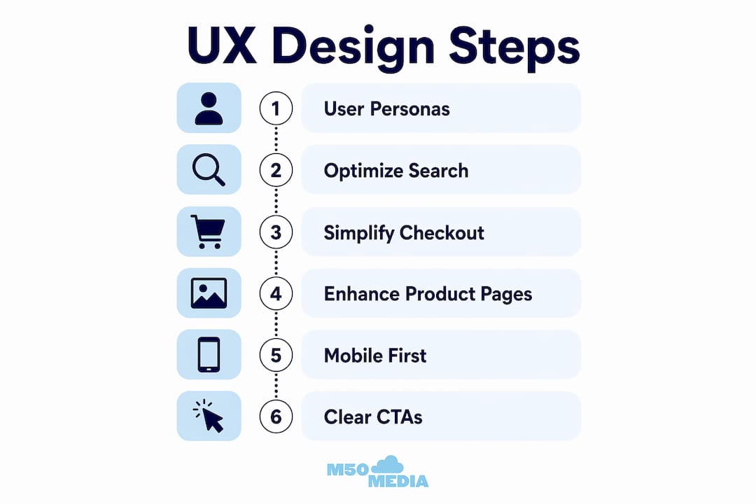
Start with validated user personas. Creating validated personas shifts your design decisions from assumptions to real user behaviours. You stop designing for yourself and start designing for the person actually spending money on your site. Interview real customers, review session recordings in tools like Hotjar or Microsoft Clarity, and build personas grounded in data.
Optimise your site search. Shoppers who use internal search convert at significantly higher rates than those who browse. Your search function needs to handle typos, synonyms, and partial queries without returning zero results. Zero results pages are conversion killers.
Simplify your checkout. This is where the 35.26% lift lives. Remove unnecessary form fields. Offer guest checkout. Display security badges near payment fields. The checkout flow design should match your customer profile: returning customers with saved data often convert better through a three-step flow, while guest-heavy stores benefit from a single-page design.
Make product pages do the heavy lifting. Clear product titles, multiple high-quality images, scannable bullet-point specs, and visible social proof are non-negotiable. Pair this with optimised product pages for SEO and you get both discovery and conversion working together.
Design for mobile first, not mobile second. Mobile commerce accounts for a growing share of all online purchases. Thumb-friendly tap targets, fast load times, and simplified navigation are not optional extras.
Pro Tip: Use clear, specific calls to action like “Add to Cart” or “Buy Now” rather than vague labels like “Continue” or “Proceed.” Ambiguity at the decision point costs you sales.
UX vs. UI vs. CRO: what is the actual difference?
This is where a lot of ecommerce businesses waste money. They invest in a beautiful redesign (UI), run A/B tests (CRO), and wonder why conversions are still flat. The problem is usually UX.
Here is how the three concepts relate to each other:
Concept | What It Covers | Common Mistake |
UX (User Experience) | The full shopper journey, from discovery to post-purchase | Treating it as an afterthought or conflating it with aesthetics |
UI (User Interface) | Visual design: colours, typography, button styles, layout | Assuming a beautiful UI means good UX |
CRO (Conversion Rate Optimisation) | Data-driven testing to improve specific conversion metrics | Using CRO to patch problems that are actually UX failures |
The critical insight here is that CRO cannot compensate for fundamentally poor UX. If your navigation is confusing, your checkout is broken, or your product pages lack trust signals, no amount of A/B testing will fix the underlying problem. CRO is the measurement layer. UX is the foundation.
A store can have gorgeous UI and terrible UX. Think of a beautifully designed site where the menu is hidden behind an obscure icon, the search bar is invisible, and the checkout requires account creation. Stunning to look at. Painful to use. Solid UX forms the foundation on which CRO builds. Without it, your optimisation efforts are rearranging deck chairs.
What are the most common ecommerce UX pitfalls?
Even experienced ecommerce teams fall into these traps. Knowing them ahead of time saves you a lot of expensive trial and error.
Minimalism taken too far. Minimalist design trends can hurt conversion when they hide navigation, remove helpful labels, or strip out the context shoppers need to make decisions. Predictability and clear calls to action outperform premium but confusing designs every time.
Ultra-thin iconography with no labels. An icon that means “wishlist” to your designer means nothing to a first-time visitor. Label your icons. Always.
Fake scarcity signals. “Only 2 left!” when you have 500 in stock is the kind of trick shoppers notice. Artificial urgency harms trust and long-term loyalty. Use factual, transparent urgency instead, like actual stock levels or real sale end dates.
Treating UX as a final polish step. UX decisions about product categorisation, search logic, and error handling have direct revenue consequences. Integrating UX thinking early in development costs far less than retrofitting it after launch.
Ignoring error states. A confusing error message at checkout is one of the fastest ways to lose a sale. Every error state should tell the shopper exactly what went wrong and how to fix it.
Pro Tip: Before your next site update, run a five-person usability test using a tool like UserTesting or Maze. Five users will surface roughly 85% of your major UX issues. You do not need a massive research budget to get meaningful results.
How do you measure and improve ecommerce UX over time?
Measuring UX effectiveness is not a one-time audit. It is an ongoing practice. Here are the metrics and methods that matter most.
Conversion rate by funnel stage. Track where shoppers drop off: homepage, category page, product page, cart, checkout. Each drop-off point tells you where UX is failing.
Bounce rate by landing page. A high bounce rate on a product page often signals a mismatch between ad promise and page experience.
Average order value (AOV). Good UX that surfaces relevant products and upsells naturally increases AOV without feeling pushy.
Customer lifetime value (CLV). This is the long game. Shoppers who have great experiences return. Tracking CLV shows you the compounding return on UX investment.
Session recordings and heatmaps. Tools like Hotjar, Microsoft Clarity, and FullStory show you exactly where shoppers click, scroll, and rage-click. Rage-clicks are a gift. They tell you precisely where frustration lives.
Combine these metrics with conversion rate optimisation tips and you have a continuous improvement loop. Test a hypothesis, measure the result, iterate. The stores that win are the ones that never stop improving.
Pro Tip: Set up funnel tracking in Google Analytics 4 before you make any UX changes. You need a baseline to know whether your changes actually worked.
Key takeaways
Effective ecommerce UX is the single most direct lever for improving conversion rates, customer loyalty, and long-term revenue growth.
Point | Details |
UX drives measurable revenue | Checkout optimisation alone can deliver a 35.26% conversion lift for large ecommerce stores. |
First impressions are almost instant | Shoppers form their opinion in 2.6 seconds, making speed and clarity non-negotiable. |
UX is not UI or CRO | Beautiful design and A/B testing cannot fix a broken user journey. Fix the foundation first. |
Fake urgency destroys trust | Transparent, factual scarcity signals outperform manufactured pressure every time. |
Measure before and after changes | Baseline metrics in Google Analytics 4 are required to prove UX improvements are working. |
Karl’s take: stop treating UX like a coat of paint
Here is something I see constantly with ecommerce clients: they spend months on branding, photography, and ad creative, then bolt on UX as a last-minute checklist item before launch. It is like building a beautiful restaurant and forgetting to train the staff. The décor gets compliments. The reviews are brutal.
UX is not decoration. It is the architecture of your business decisions. Where you put the search bar, how you handle out-of-stock products, what your error messages say, whether your checkout asks for a phone number nobody needs. These are not design details. They are revenue decisions. And they need to be made early, not patched in after the fact.
The ecommerce stores I have seen grow consistently are the ones that treat UX as a core business function, not a creative exercise. They test with real users, they measure obsessively, and they resist the temptation to chase design trends at the expense of clarity. If your store looks great but converts poorly, the answer is almost never “more ads.” It is almost always “fix the experience.” Explore ecommerce branding and trust as a complement to UX, not a substitute for it.
— Karl
Ready to fix your ecommerce UX? let’s talk.
If you have read this far, you already know that UX is not a nice-to-have. It is the difference between a store that converts and one that bleeds traffic. At M50media, we work with ecommerce business owners to identify exactly where their user experience is costing them sales and build a clear plan to fix it.

Whether you want hands-on digital coaching or just need a sharp second opinion on your store, we have options for every stage of growth. Book a free Marketing SOS call with Karl and walk away with real, specific direction for your ecommerce UX. No fluff, no generic advice. Just the stuff that actually moves the needle.
FAQ
What is the role of UX in ecommerce?
UX in ecommerce is the design of every interaction a shopper has with your online store, from navigation and search to checkout and post-purchase communication. Its primary role is to reduce friction, build trust, and increase the likelihood that visitors convert into paying customers.
How much can UX improvements increase ecommerce conversions?
Checkout optimisation alone can deliver a 35.26% conversion lift for large ecommerce sites, with broader UX improvements to search and product pages driving a 40–60% revenue lift within two quarters.
What is the difference between UX and UI in ecommerce?
UI covers the visual components of your store, such as colours, fonts, and button styles. UX covers the full shopper journey and how every interaction feels. A store can have excellent UI and poor UX if it looks great but is confusing to navigate.
Can CRO replace good UX design?
No. CRO cannot compensate for fundamentally poor UX. Conversion rate optimisation tests and refines experiences that already work. It cannot fix broken navigation, confusing checkout flows, or missing trust signals.
How do i start improving my ecommerce UX?
Start by tracking your funnel drop-off points in Google Analytics 4 and running session recordings with a tool like Hotjar or Microsoft Clarity. Then run a small usability test with five real users to surface your biggest friction points before making any changes.
Recommended
Comments